The Magical World of the Box Model in CSS
The box model is a fundamental concept in CSS that defines how elements are sized, spaced, and positioned on a web page. It consists of four main parts: content, padding, border, and margin. Each part plays a crucial role in determining the appearance and layout of your designs. In this section, we'll explore the fascinating world of the box model and learn how to use it effectively to style your elements. Let's embark on this box model adventure!
Content
The content area is the heart of the box model. It represents the actual content of the element, such as text, images, or other elements. You can specify the size of the content area using the width andheight properties. Here's an example:
div {
  width: 300px; /* Sets the width of the content area */
  height: 200px; /* Sets the height of the content area */
}
In the code above, we set the width and heightproperties to define the size of the content area. The content will be contained within this area, and any additional spacing or borders will be added outside of it. For example, if you have a paragraph of text, the content area will determine how much space the text occupies on the page.
Padding
Padding is like a cushion around the content area. It provides breathing room between the content and the border. Padding helps separate the content from other elements, creating a visually appealing layout. You can specify padding using the padding property. Here's an example:
div {
  padding: 20px; /* Adds 20 pixels of padding around the content */
}
In the code above, we set the padding property to 20 pixels, creating a uniform padding around the content area. Padding is useful for creating space between the content and the border, improving readability, and adding a sense of balance to your designs. You can also specify different values for each side, such as padding: 10px 20px 15px 30px, to add more or less padding to specific sides.
Border
The border surrounds the padding and content areas. It can be used to create a visible boundary around an element or to add decorative effects. Borders can have different styles, such as solid, dashed, or dotted, and you can specify their width and color. Here's an example:
div {
  border: 1px solid black; /* Adds a 1-pixel solid black border */
}
In the code above, we set the border property to create a 1-pixel solid black border around the element. You can adjust the border width, style, and color to create different border effects. Borders can be used to highlight important elements, create visual boundaries, or add decorative touches to your designs.
Margin
Margin is the space outside the border. It provides separation between elements and the surrounding content. Margin helps create breathing room and prevents elements from appearing too cramped or cluttered. You can specify margin using the margin property. Here's an example:
div {
  margin: 10px; /* Adds 10 pixels of margin around the element */
}
In the code above, we set the margin property to 10 pixels, creating a uniform margin around the element. Margin is useful for creating space between elements, improving readability, and adding a sense of balance to your layouts. You can also specify different values for each side, such asmargin: 5px 10px 15px 20px, to add more or less margin to specific sides.
Understanding the Box Model
The box model can be visualized as a set of nested boxes. The innermost box is the content area, surrounded by the padding, border, and margin boxes. Here's an illustration:
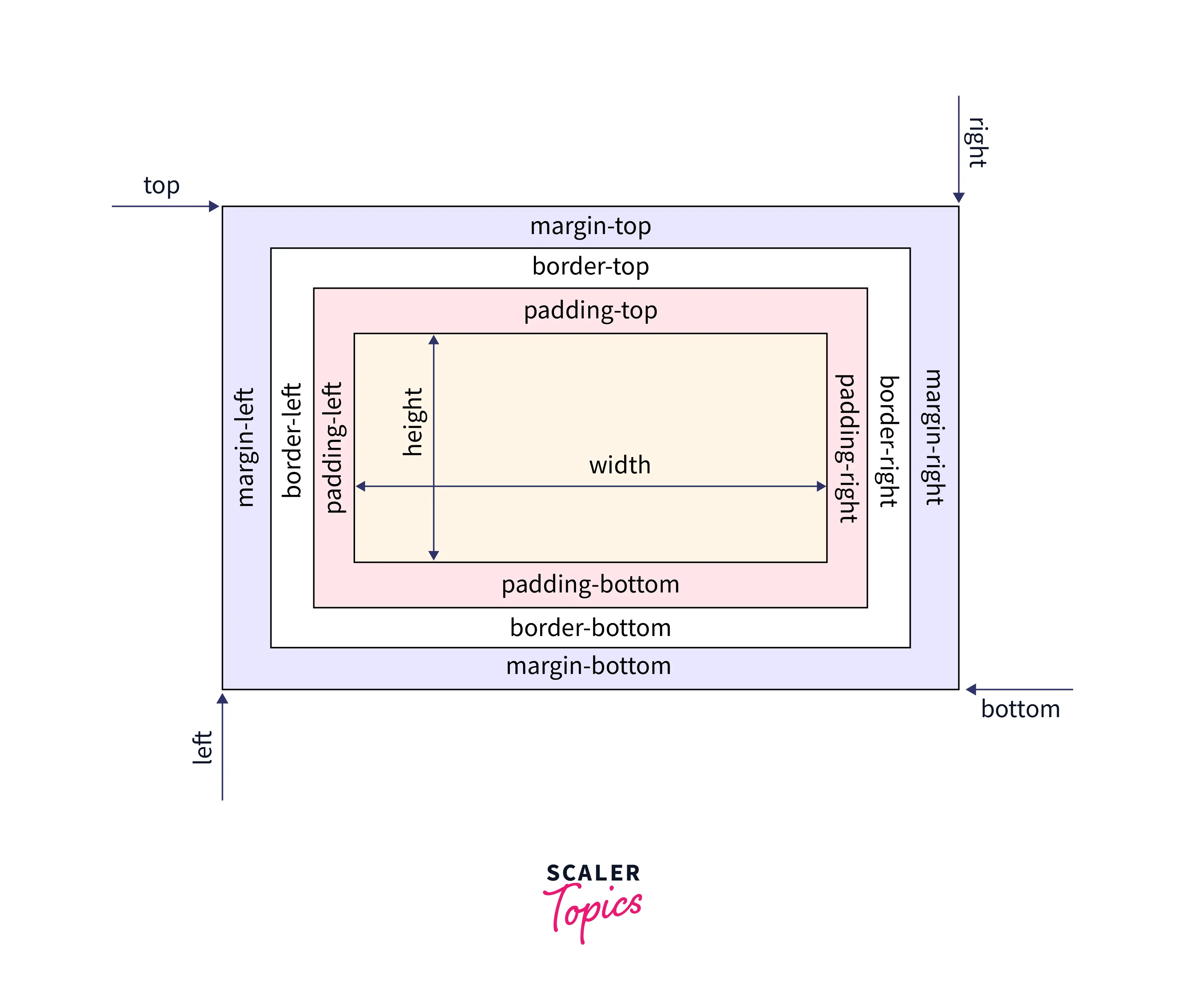
In the illustration above, you can see how the content, padding, border, and margin boxes are arranged. The total width and height of an element include the content, padding, border, and margin sizes. Understanding the box model is crucial for creating precise and responsive layouts.
Total Width and Height
It's important to note that the total width and height of an element include the content, padding, border, and margin sizes. For example, if you have an element with a width of 200 pixels, 10 pixels of padding, a 1-pixel border, and a 5-pixel margin on each side, the total width will be 264 pixels (200 + 10 + 10 + 10 + 10 + 5 + 5 + 5 + 5 + 1 + 1 + 1 + 1), Remember padding has four sides, the top, right, bottom and left, thats why we added 10 four times and the same goes to those other property, they have four sides. This is something to keep in mind when designing layouts or positioning elements.
Default Browser Styles
By default, the browser applies some padding and border styles to certain elements, such as paragraphs or headings. These default styles can affect the layout and appearance of your designs. You can reset these default styles by setting the padding and border properties to 0. Here's an example:
p {
  padding: 0; /* Removes the default padding */
  border: 0; /* Removes the default border */
}
In the code above, we reset the default padding and border styles for paragraphs. This ensures that your designs are based on your specified styles rather than the browser's default styles.
Responsive Design and Width
When creating responsive designs, it's common to use percentages for widths to make elements adapt to different screen sizes. However, if an element has padding, border, and margin, it may exceed the available space. To prevent this, you can use the box-sizing property with the valueborder-box. This includes the padding and border in the width and height calculations, ensuring that the element doesn't exceed its container. Here's an example:
div {
  box-sizing: border-box; /* Includes padding and border in width and height calculations */
}
In the code above, we set the box-sizing property toborder-box, ensuring that the element's width and height include the padding, border, and margin sizes. This helps create responsive designs that adapt to different screen sizes without overflowing their containers.
If you are still confused with the Box Model, watch this Youtube video
Practice Time!
Now it's time to put your knowledge into practice! Open your code editor and create a new HTML file. Let's explore the wonderful world of the box model:
- Create a simple HTML structure with div elements to serve as containers for your box model experiments.
- Apply different width and height values to the content area and observe how they affect the size and layout of your elements.
- Experiment with padding to create breathing room around your content. Try using different values for each side to see the impact on the layout and readability.
- Add borders to your elements to create visual boundaries or decorative effects. Play with different border styles, widths, and colors to see the variety of effects you can achieve.
- Adjust the margin to create separation between elements. Observe how the margin affects the spacing and overall appearance of your designs. Try using larger and smaller values to see the difference.
- Refer to box model resources and tutorials to discover creative ways to use the box model, such as creating complex layouts, achieving specific visual effects, or improving the responsiveness of your designs.
- Experiment with the
box-sizingproperty to include padding, border, and margin in width and height calculations. Observe how it affects the layout and responsiveness of your designs.
Remember, the box model plays a crucial role in web design. It helps define the size, spacing, and positioning of your elements. Choose box model values that align with your design goals, ensure readability, and create visually appealing and user-friendly interfaces. Happy coding and happy designing!